


MORE BARKING FOR BLOOD SQUAD SEVEN
Ongoing Image series on sale now

If you don’t mind, I want to talk a bit about BLOOD SQUAD SEVEN.
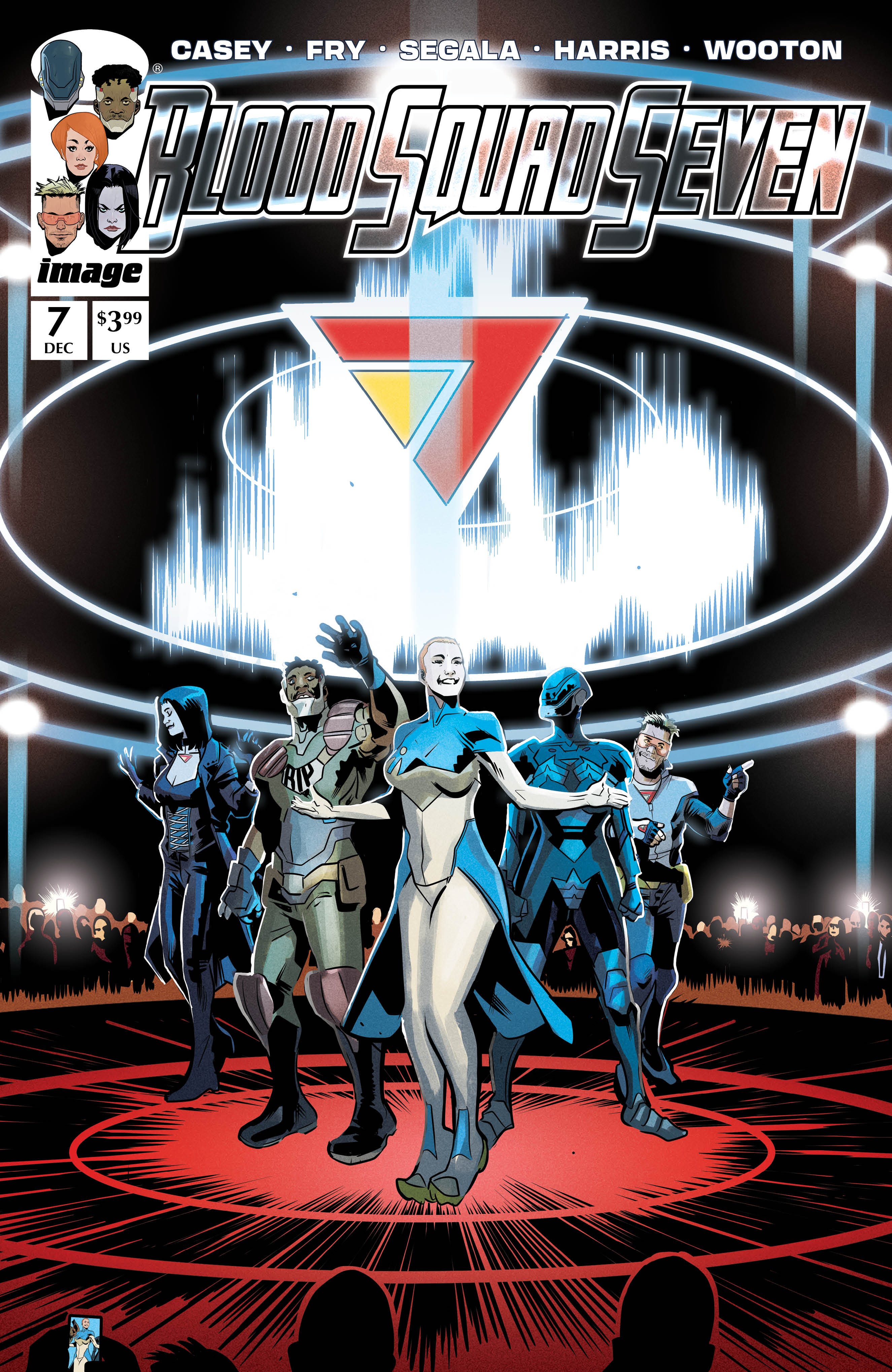
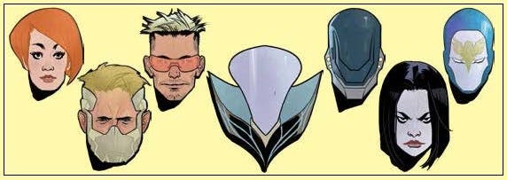
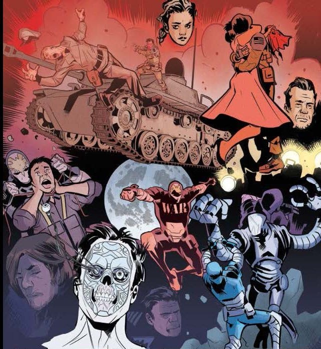
It’s the ongoing series I’m currently writing at Image Comics, with Paul Fry providing the art on each and every issue. Technically, it’s a creator-owned series, but with a few caveats. As a series that directly involves the history of the Image Comics shared universe, treating it as the real time backstory for the current events we’re depicting. That means we’ve featured flashback appearances involving Erik Larsen’s Savage Dragon and Superpatriot and Todd McFarlane’s Spawn, among others. We’ve also incorporated more obscure characters originally published in some of those early Image Comics from the early 1990’s, including Infiniti, Ripcord, Enigma and Beté Noir (co-owned by Image publisher, Eric Stephenson and artists Richard Horie and Chris Sprouse).
So far, I think the series has been a lot of fun. It’s certainly been fun to write and put together. We’re treating the Image Universe as a bona fide shared universe that has endured and evolved over the last thirty plus years (even if the books that still survive from the original launch don’t).

It’s not a comicbook that’s burning up the sales charts. As with most of my creator-owned work, it exists mainly on a cult level. But that’s okay. Sure, I wish it would sell a lot more, but we’re getting to tell our story, our way, and fundamentally that’s what creator-owned comicbooks are all about for me. But do I feel like BLOOD SQUAD SEVEN has been largely overlooked? Probably. But, like I said, it’s still been great fun.
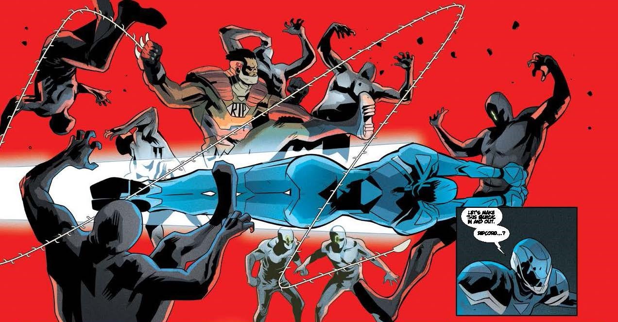
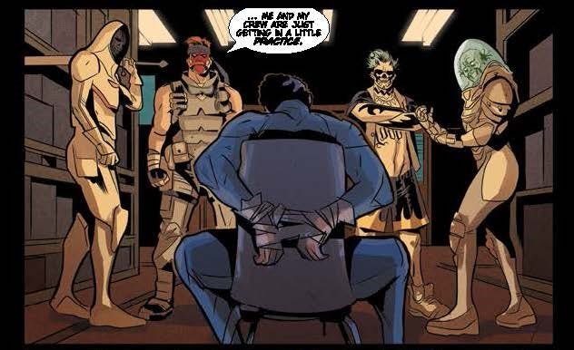
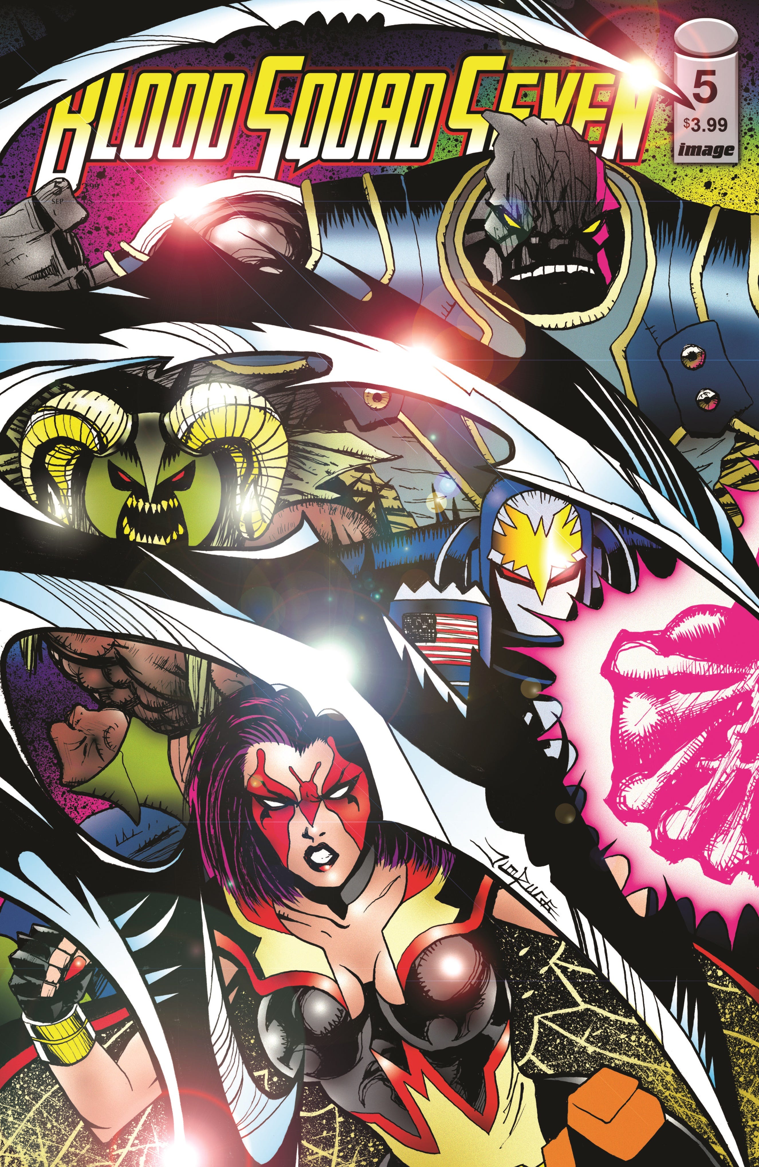
At the time of this writing, issue #7 is due to hit stores in a few weeks. Issue #8 will wrap up the current story arc, where the new team faces off against its first official super-villain adversaries. But starting with issue #9 (out in June) things are about to get serious. Maybe even a little dark. Maybe even a bit political. Going for more real world story analogies. Regardless, I feel like, by then, we’ll have spent nine issue (eight regular issues and an oversized STRIKEFILE issue) building the world, the team and their concept… now it’s time to take this shiny new car out for a real spin.
From the very beginning, one of my creative angles on the series was, “What if we did a Watchmen-style comic, but swapping out the 1960’s Charlton characters that served as inspiration in that series with the original 90’s Youngblood characters?” As it turns out, the series has tapped into some of the same creative energy that fueled past work of mine like WILDCATS Vol. 2 and WILDCATS VERSION 3.0. So if for anyone who read and remembers those runs, then they should love BLOOD SQUAD SEVEN.
This is a genuine attempt to fashion what I could classify as a modern superhero comicbook. Now, I’ll admit, that kind of statement might sound great in a sound bite, but under closer scrutiny, perhaps demands a little more thorough explanation. And, to be honest, I still struggle with putting that statement in its proper context. I suppose it means that we’re trying to express ideas and emotions and situations that are rooted in the now, as opposed to trying to “recreate” some past era of comicbook storytelling (something I’m quite familiar with in certain strands of my own work) or attempting to use storytelling values that evoke the past. It hopefully reflects the complexity of the current times. It doesn’t pretend to be taking place in a so-called “simpler” era for the sake of comfort and familiarity. It’s not an easy thing to do… since a lot of my deep comicbook DNA involves work created primarily in the 1970’s and 1980’s. It’s always a challenge to push yourself beyond your own influences and try to break some new ground… but without coming across as experimental for the sake of experimentation. BLOOD SQUAD SEVEN is ostensibly a superhero comicbook, and it has to deliver on its genre expectations. It’s not -- what Quentin Tarantino would call -- an “art house meditation” on superhero comicbooks. It’s got to provide the goods.
One thing I recognize about my past career work in the mainstream (and by that, I’m referring mainly to my Marvel and DC output) is that once I landed gigs like Uncanny X-Men or Adventures of Superman, my inclination was to be a little subversive. That was how I wanted to distinguish myself at the time, that I could take these icons and put some kind of a unpredictable twist on them. For instance, X-Men without the soap opera angst. Or Superman as a pacifist. You get the idea. But with something like BLOOD SQUAD SEVEN, there’s enough progressiveness baked into the concept, that I’ve tried to keep the presentation as straightforward as possible.
As you can see, artist and co-creator Paul Fry has a lot to do with how “modern” the series is. His style is slick and accessible. Colorist Francesco Segala and letterer Rus Wooton add even more polish. And graphic designer, Sonia Harris, ties it all together in a package that acknowledges the series’ roots while pushing it forward into the future. And, from the beginning, we’ve been lucky to have Jim Rugg providing variant covers for each and every issue.
The first trade paperback collection, titled VOL 1: PERILOUS RELAUNCH was released back in November 2024. So it’s out there, available for purchase as we speak. The second collection, VOL 2: CON SEASON will be released in June (to coincide with the release of issue #9). Hopefully, some of you will be compelled to check it out (if you haven’t already… if you have, you’re a friend for life).
Until next time…
Joe Casey
USA
Joe, I've been loving this book. I was a huge fan of your Wildcats work, and this definitely scratches that itch. Really fun concept and the art is stellar.
WeaponXmen was superb!