


KID COMIX 002
Putting it all out there... again...

I don’t know what it is that compels me to put this material out there for public consumption. Nevertheless, here we go again…
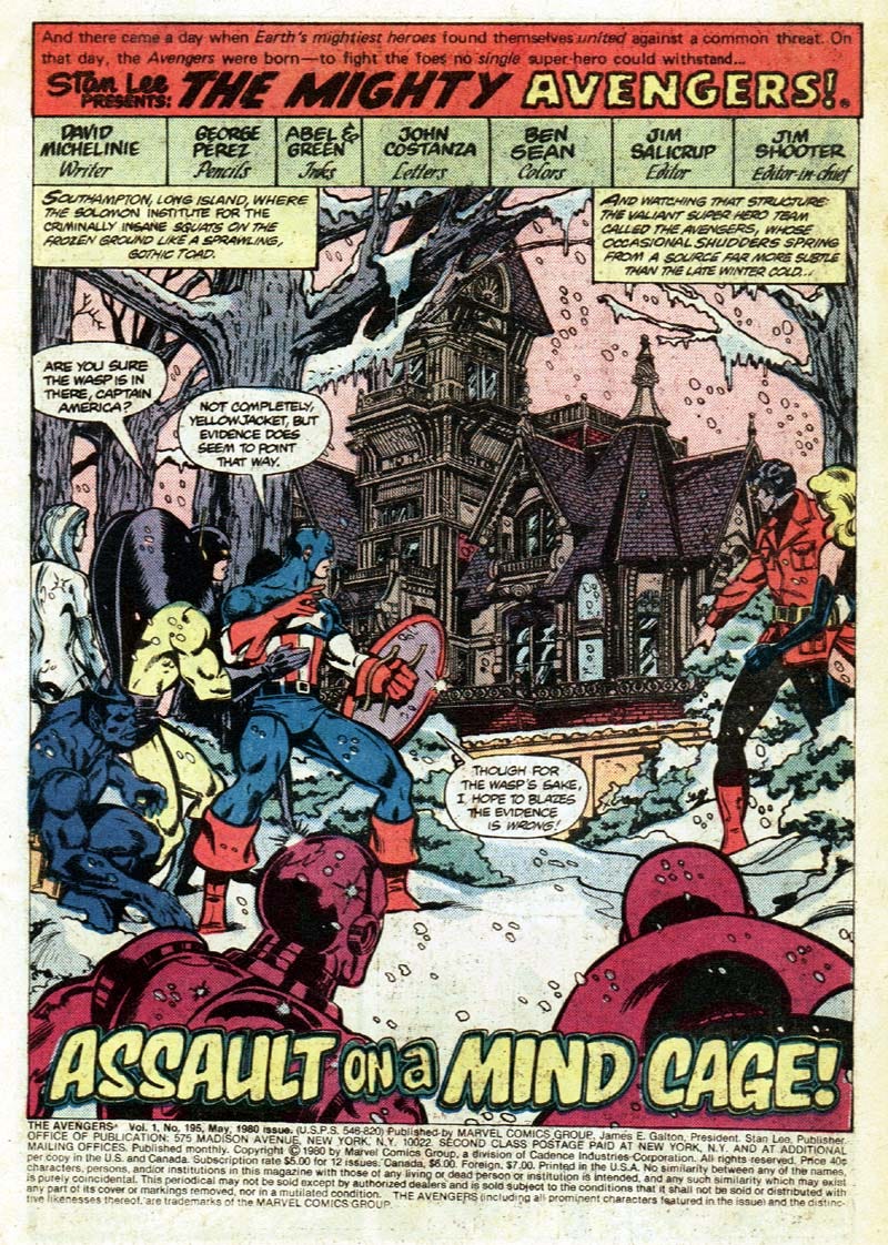
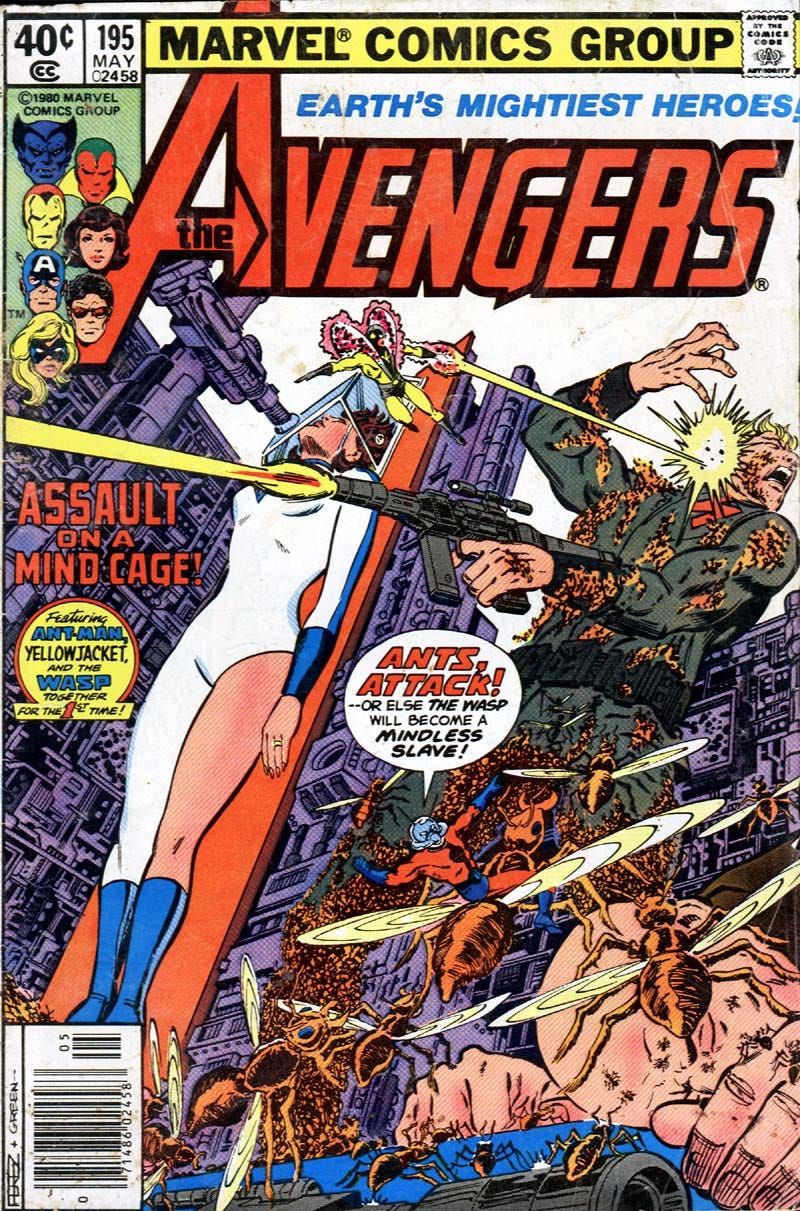
What follows was my feeble attempt at continuing the story that began in AVENGERS #194, written by David Michelinie and drawn by George Pérez (discussed in the last installment of this newsletter). That would date this at early 1980. Forty-five years ago. Drawn on spiral notebook paper -- in pencil -- and then colored (partially) with felt tip magic markers, it truly is a glorious and grotesque thing to behold. I must’ve really been knocked out by issue #194 (not surprising… it’s great), so much so that I went right to work on this. It was clearly a race against time. Could I create my own AVENGERS #195 before the real issue was actually published? Read on for the answer…!
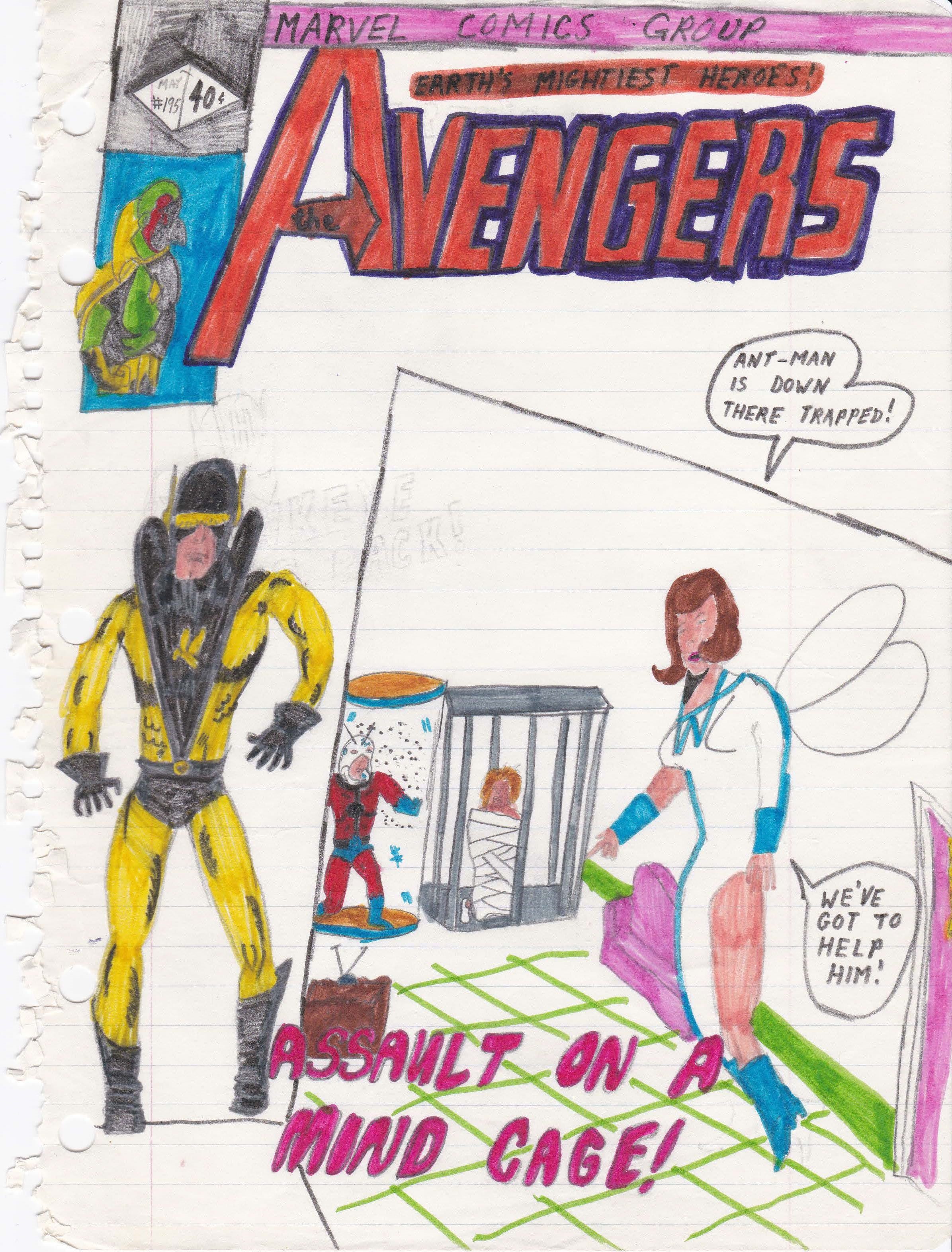
The cover. You can see right away that crafting dynamic cover layouts was not my strong suit. But at least I went so far as to draw each and every component of the typical trade dress that adorned every Marvel comicbook of that period, including the price (40 cents) and the famous “Marvel Comics Group” masthead. You can also see the faint pencils of an idea I must’ve erased… a drawing of Hawkeye and the accompanying text: “Hawkeye is back!” I guess I must’ve thought better of it. I mean, why ruin the surprise?
You can see I decided to return the Vision to the cover corner box, lifted directly from a panel from the previous issue, #194. I can’t speak to the motivation to do that, since I am such a freak for the John Byrne heads that became the standard for most Marvel team books around that time. I loved them, but I guess I didn’t feel like drawing them.
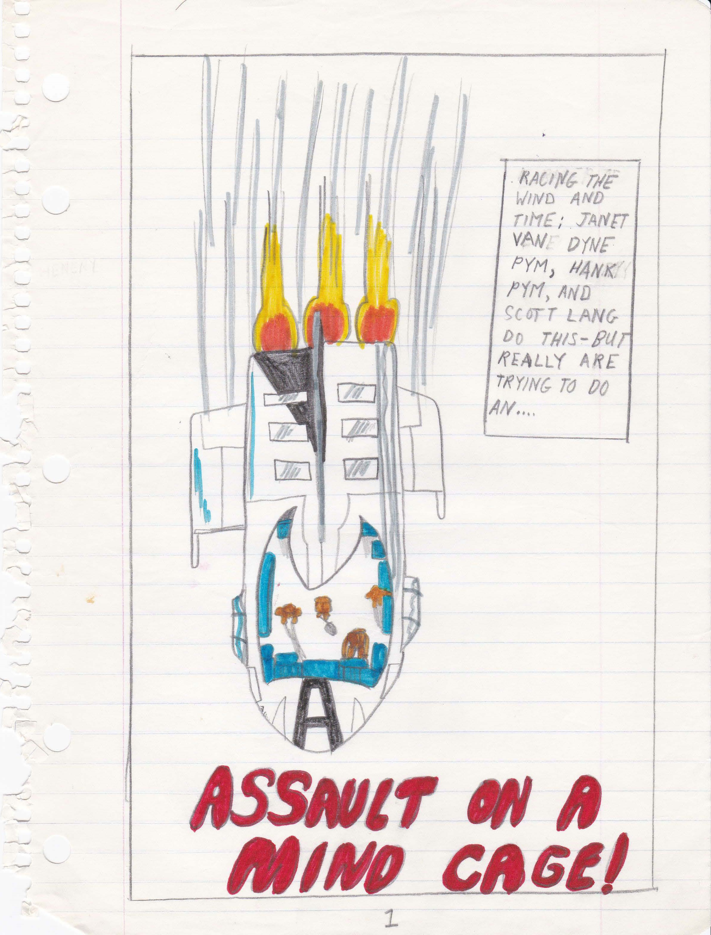
Page One. Not a bad rendition of a Quinjet, if you ask me. By then, George Pérez and John Byrne in particular had depicted the Quinjet in great detail, so I guess I felt like I knew it pretty well. I’m actually a little impressed with the monochromatic coloring I applied to the characters inside. I must’ve lifted that from a previous issue, too.
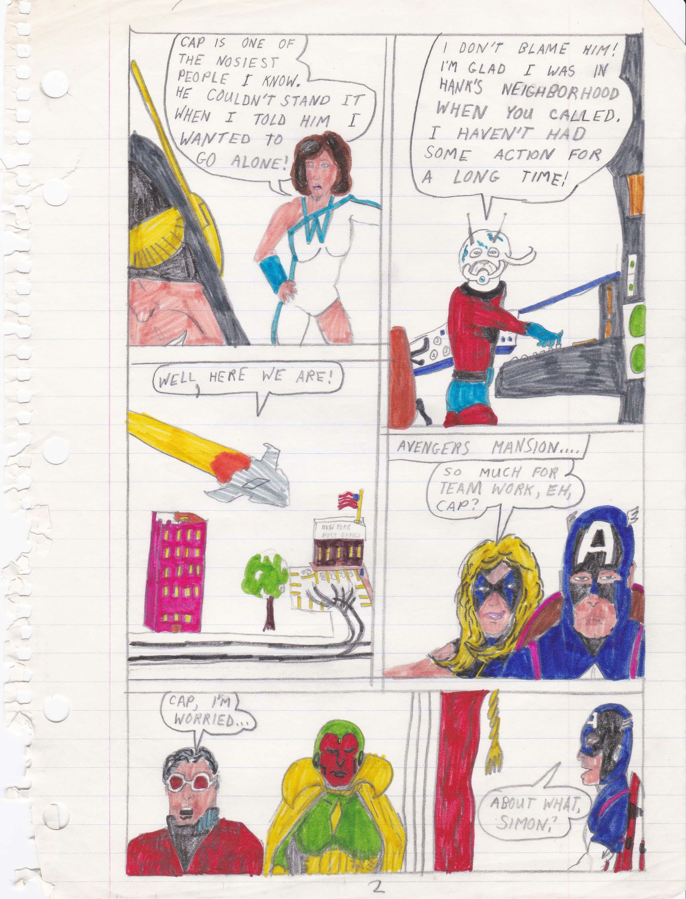
Page Two. Aside from the “New York Post Office” in Panel 3 being a particularly odd touch, this is me padding the story in order to show the journey. I give myself credit for picking up the cue from the “next issue” blurb at the end of the previous issue and bringing in Yellowjacket and Ant-Man right away. Although, my version has the Wasp calling them in for assistance on her mission. In the real comicbook, the Avengers call them in, and Michelinie and Pérez wisely skip all the travel shenanigans and kick things off right outside the Solomon Institute, with the Wasp already inside.
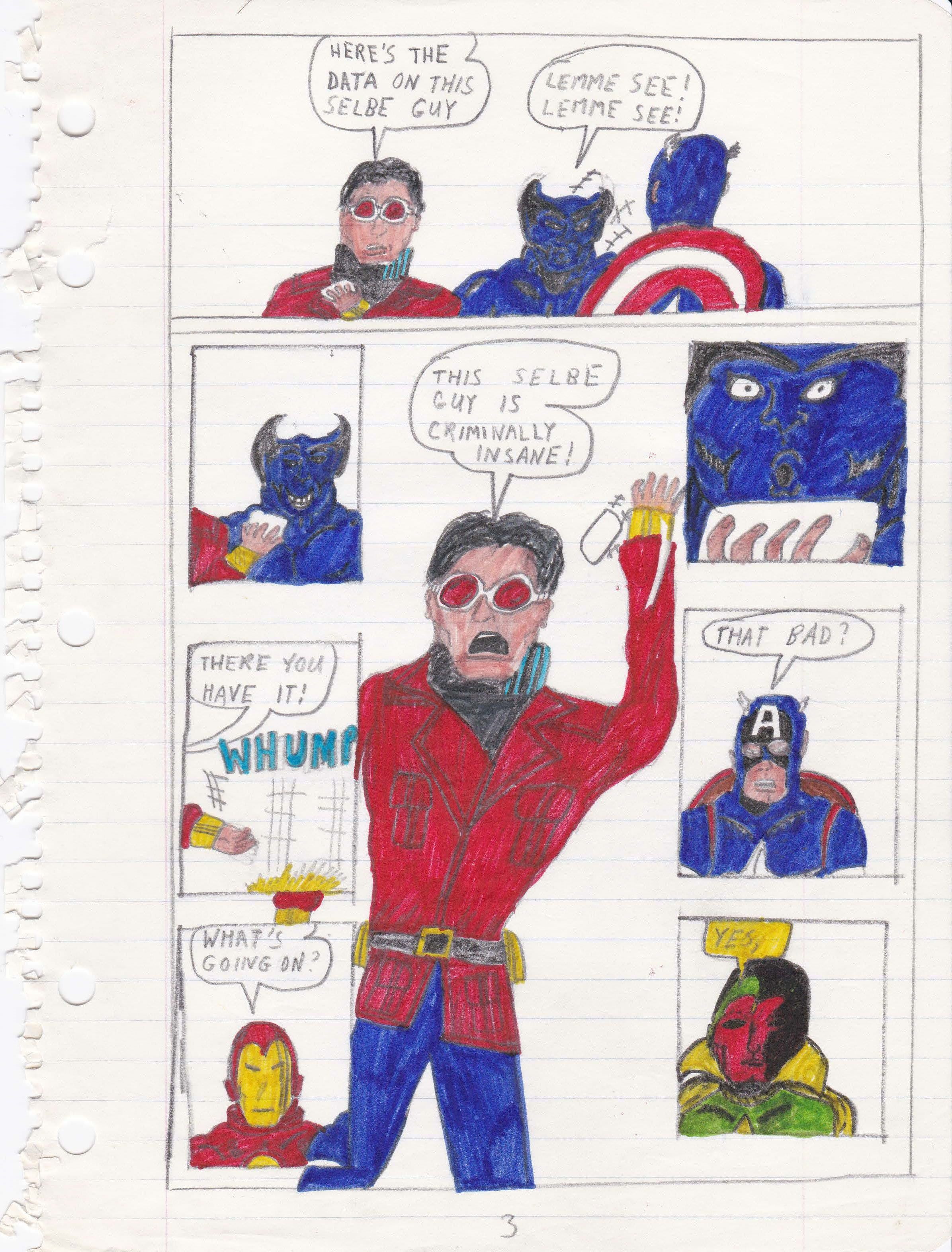
Page Three. Okay, so I obviously lifted the panel layout straight from the George Pérez-designed page in the previous issue. Of course, I get it completely wrong. The order of the panels doesn’t tell the story in a linear way. I mean, it almost works. Close, but no cigar.
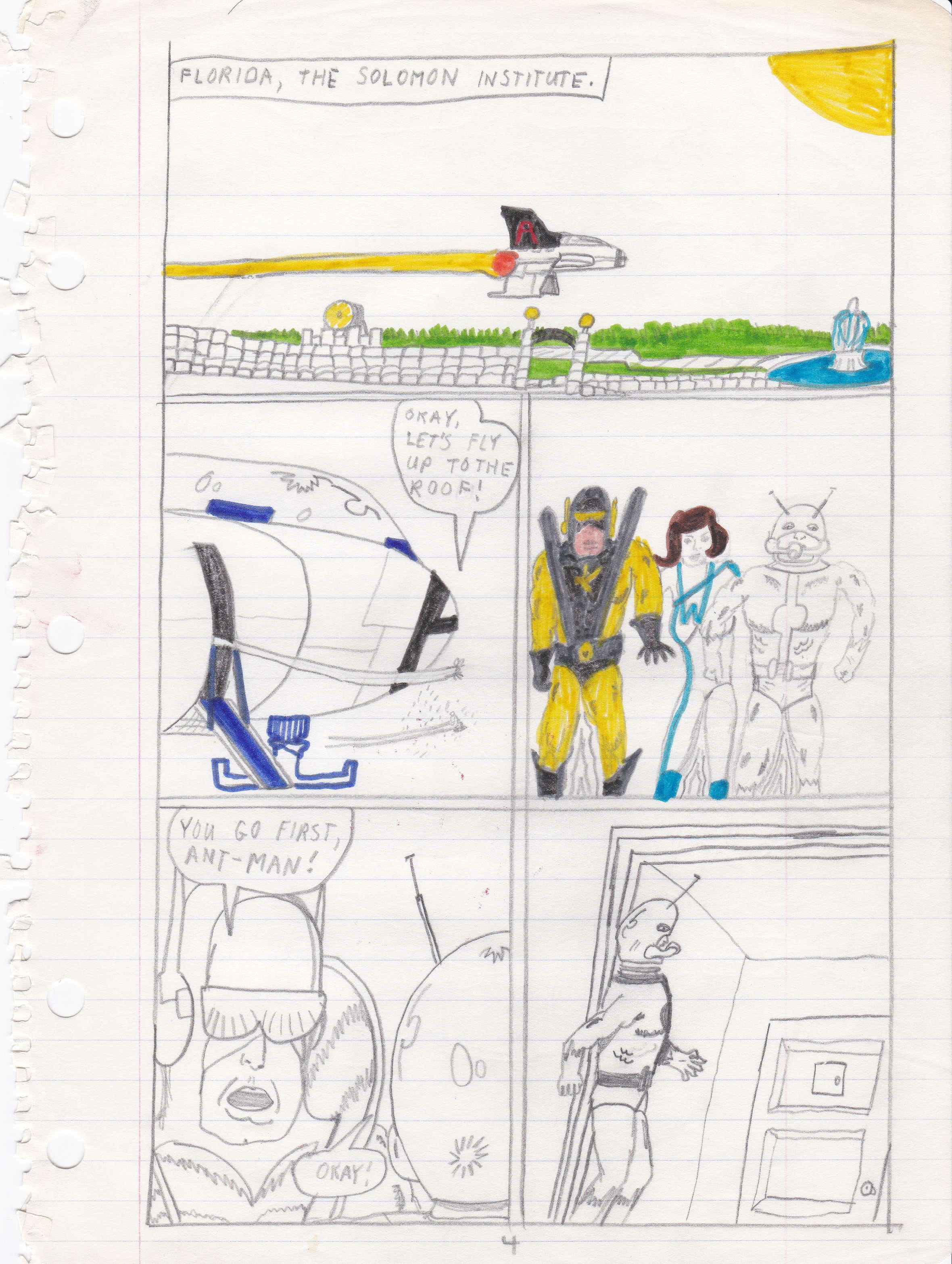
Page Four. I have no idea what compelled me to put the Solomon Institute in Florida, especially since I established a New York post office on Page Two with accompanying dialogue that reads, “Well, here we are!” And I suppose I also ran out of steam in the coloring department. Or maybe my magic markers finally went dry…
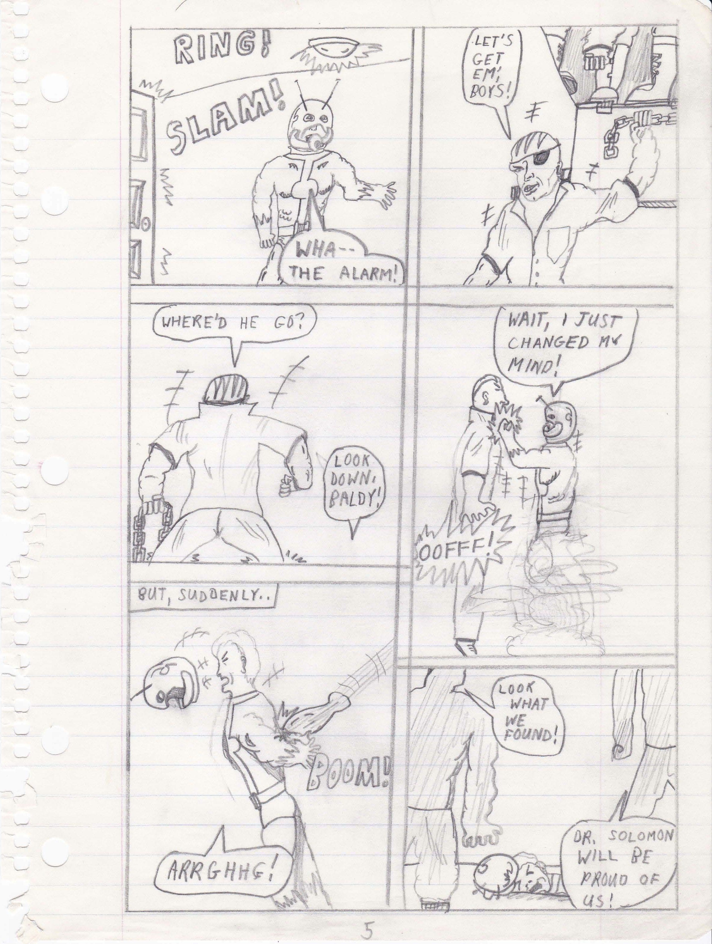
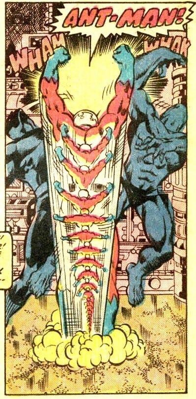
Page Five. The design of my “thug” is fairly stereotypical of the time. Street gang punk rock bald guy armed with a chain. Ant-Man’s sneak attack is something else I lifted from Pérez, a move he performed way back in another one of the seminal comicbooks of my young life, AVENGERS #161.
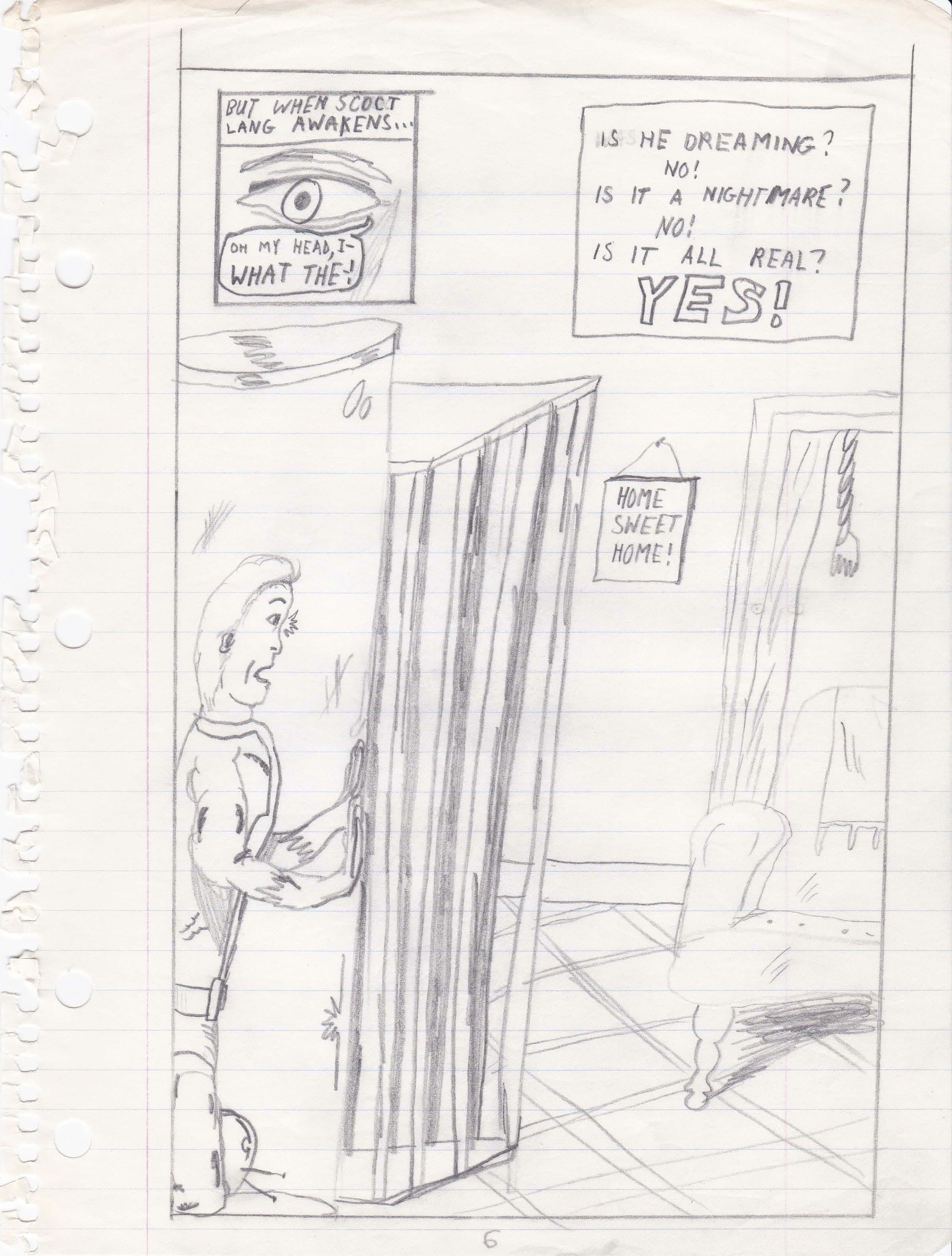
Page Six. Human-sized cages placed in otherwise “normal” rooms still reads as a bit creepy to me. I’m sure, at the time, the choice was borne out of pure laziness on my part, but it kinda works. The cherry on top is the “Home Sweet Home” sign hanging on the wall. And dig the call-and-response riff in the caption: “Is he dreaming? No! Is it a nightmare? No! Is it all real? YES!” Stan Lee would’ve been proud…
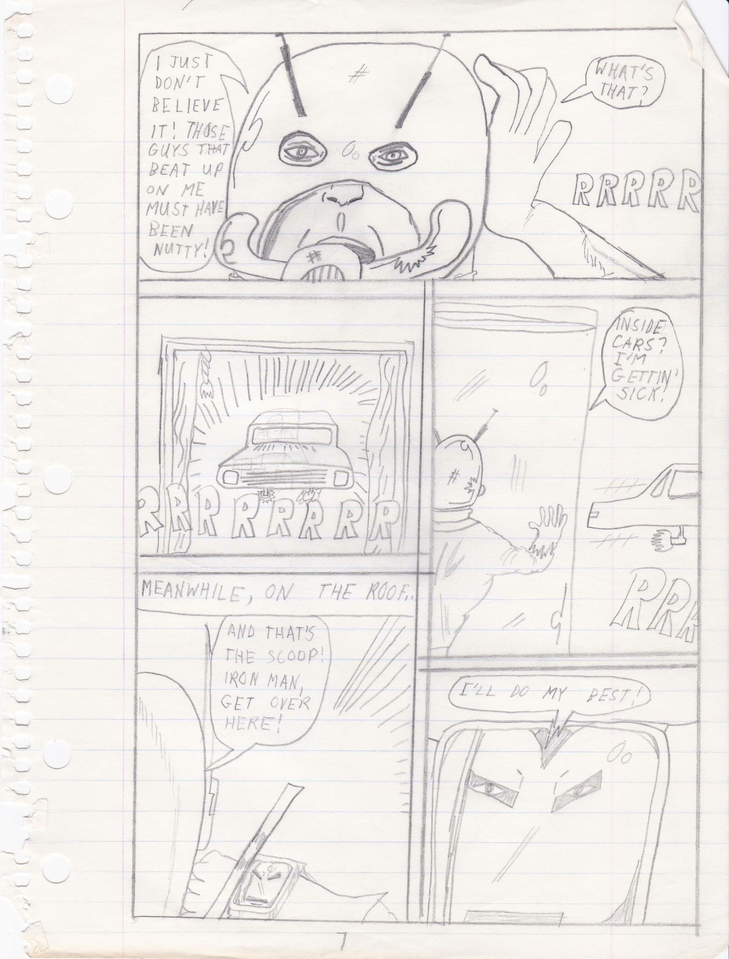
Page Seven. “Inside cars? I’m getting’ sick!” You and me both, Ant-Man. I don’t know what I was thinking with that gag…! My closeup of Iron Man in the last panel easily betrays what an influence Bob Layton was in how artists depicted Shellhead’s perfectly polished armor, as well as how his eyes and mouth were often seen within his helmet.
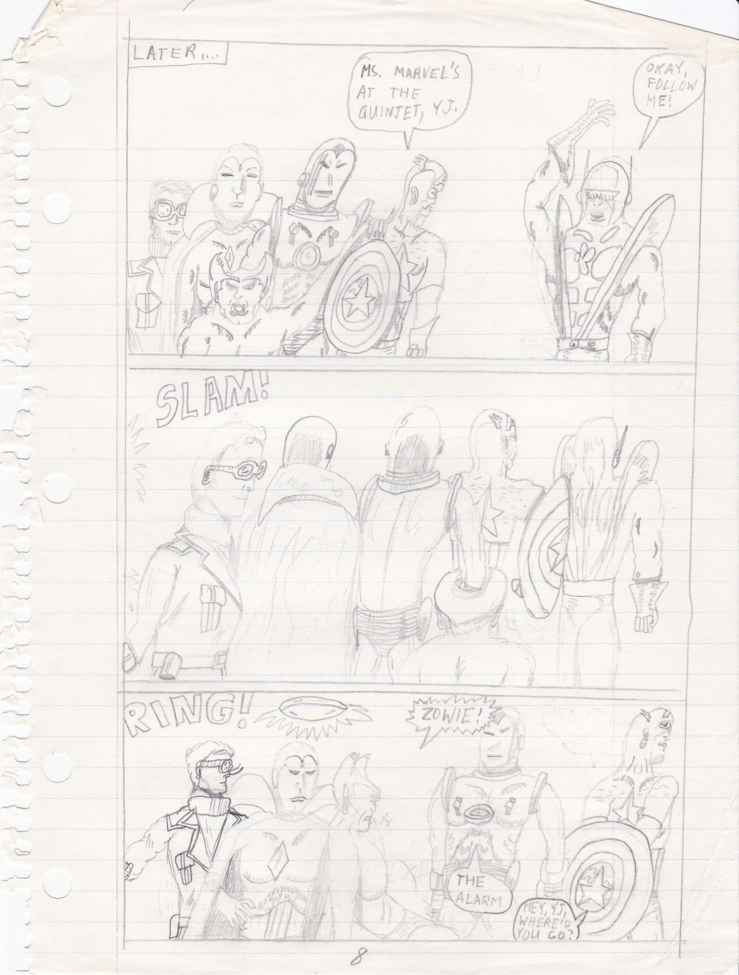
Page Eight. “Ms. Marvel’s at the Quinjet, YJ.” Was I not a big fan of Carol Danvers at that time? I don’t recall. It also looks like I’d grown bored with drawing backgrounds, in general, since there is no sense of where the Avengers are at now. I do like Cap’s neck muscles straining in the final panel as he cranes his neck to try and see something up ahead.
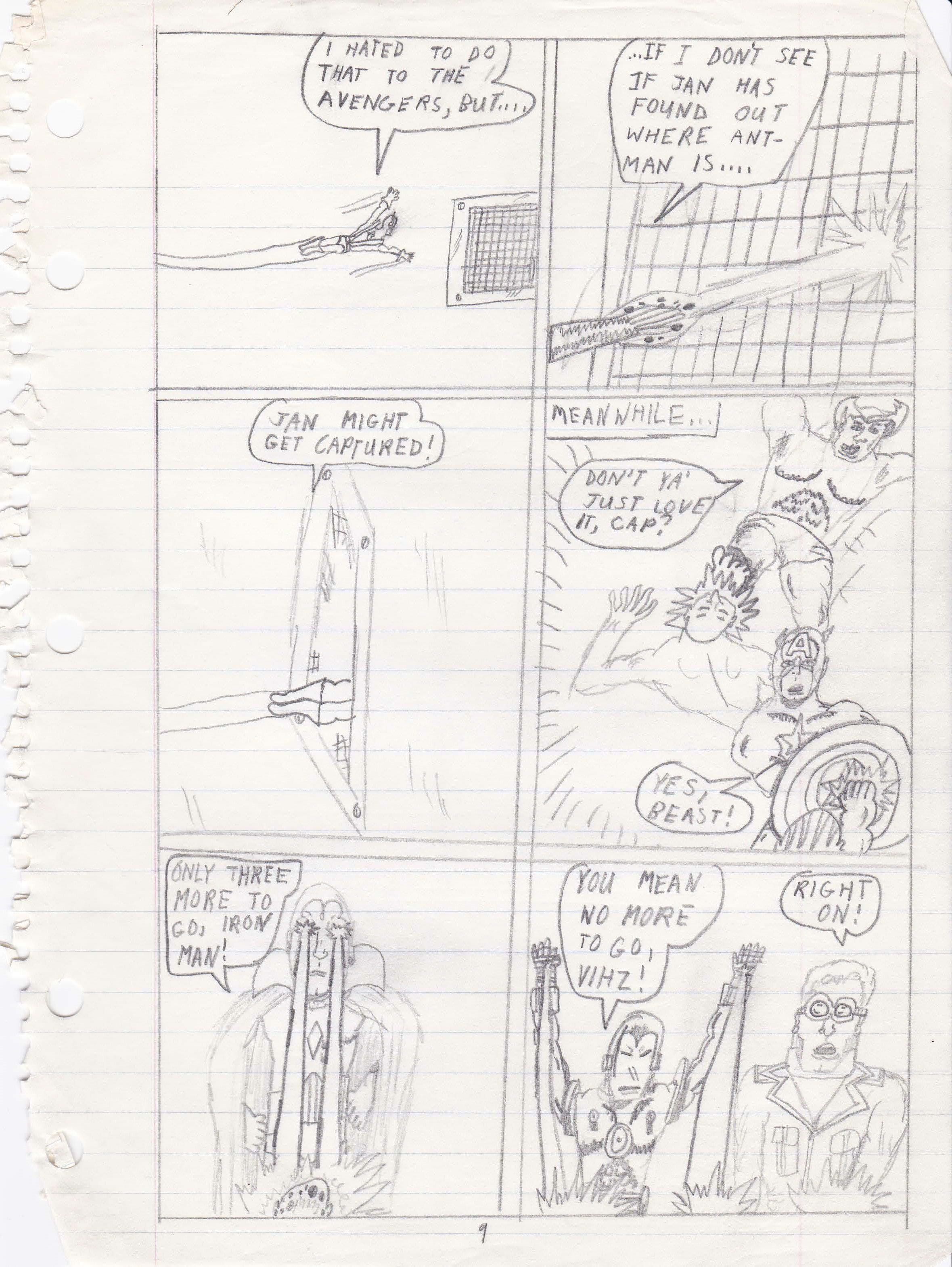
Page Nine. Pretty solid drawing of an air vent cover, huh? And the Kirby dots drawn as part of Yellowjacket’s blast in Panel Two is a nice detail. And then… FIGHT SCENE! Gotta love the way the Avengers are bantering during the beatdown: “Only three more to go, Iron Man!”… “You mean no more to go, Vihz!”… “Right on!”…
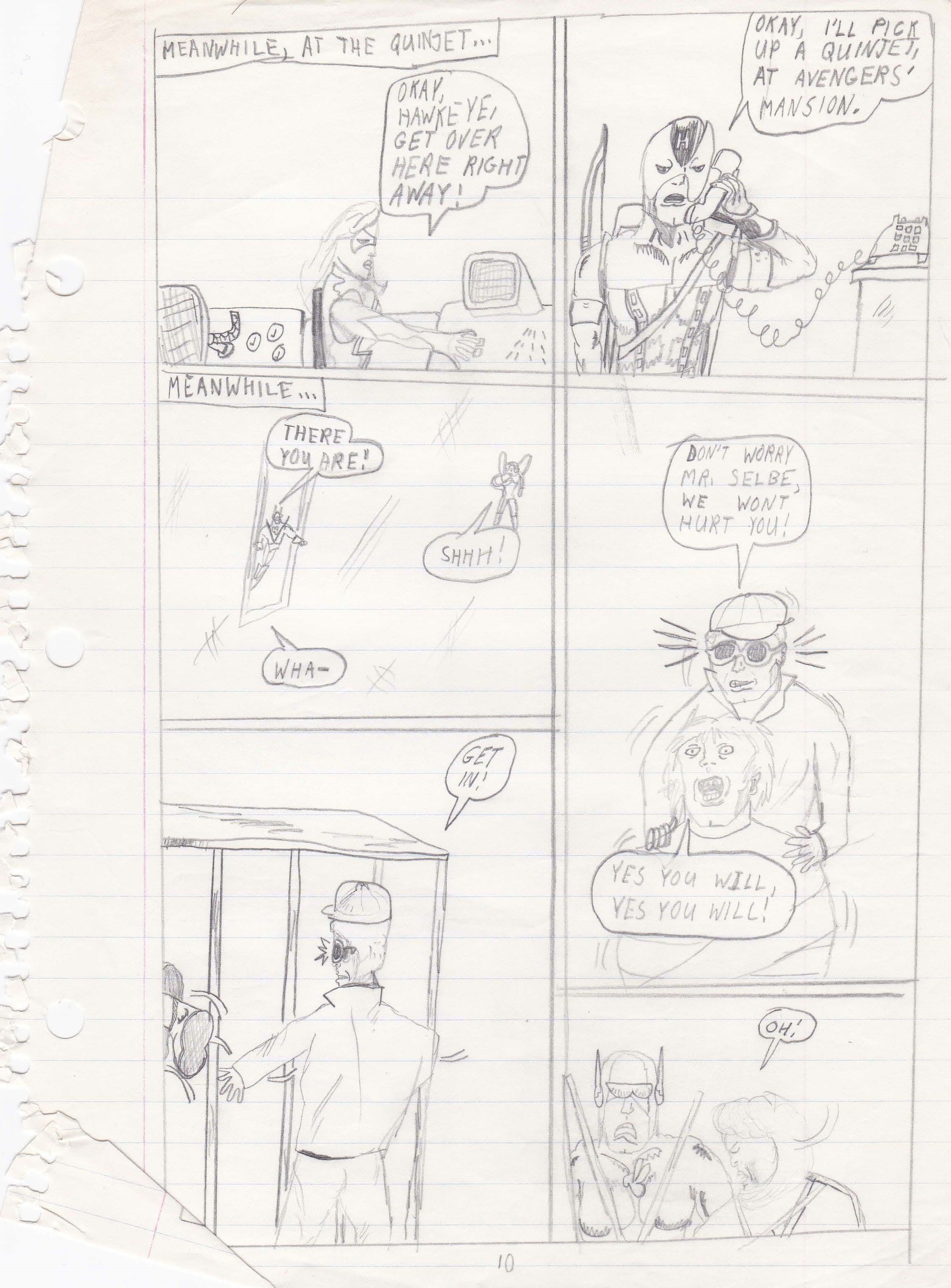
Page Ten. A-ha… now we see some method to my madness (and the rationale behind the cover element I had erased). Ms. Marvel stayed behind to call in my favorite Avenger when I was a kid, Hawkeye! Pretty harrowing stuff: “Don’t worry, Mr. Selbe, we won’t hurt you!”… “Yes you will, yes you will!”
Aaaaand… that’s as far as I got. Most likely, in the time it took for me to craft these ten pages, a month had already passed and the actual AVENGERS #195 had hit the stands, instantly rendering my version completely irrelevant.
As if there was going to be any other outcome. But, hey, at least I tried.
So, let’s see how easily I can live this one down…
Joe Casey
USA
This is brilliant and shows your commitment and dedication to the cause. How old were you when you did this? To be honest if you say 25 that would be even more hilarious. It is the sort of thing I used to do as a kid back in the day. Thanks for sharing.