
MARVEL VS. DC – PART TWO
Part Two of Two

In the previous newsletter, I went deep on how I see the Marvel Universe… and that I see it pretty much as John Byrne drew it in the late 70’s/early 80’s. Now let’s look at the other powerhouse superhero artist of that era: George Pérez.
As everyone who’s familiar with mainstream comicbook history knows, George Pérez was a straight-up superstar from his early days working at Marvel Comics. His detailed, Swan-meets-Kirby art style made an indelible mark on fan-favorite series like Avengers, Marvel Two-In-One and Fantastic Four, as well as cult classics like the Sons of the Tiger feature in Deadly Hands of Kung Fu and Inhumans, among many others.
Personally, I loved Pérez on Avengers, in particular. Some of my very favorite issues of that series were drawn by him. And yet, he’s not the quintessential “Marvel artist” to me. As I wrote about in the last newsletter, that distinction still went to John Byrne. There’s a specific reason for that… one that I can imagine is going to come across as way harsher than I’m intending it, but it’s something I believe made all the difference…
… George Pérez never drew a great Wolverine.
Just my humble opinion, of course. But think about it… in those days, drawing an iconic Wolverine could automatically make someone not only a first-class Marvel artist, it could make them an instant superstar. For an entire generation of artists, it was a bit of a litmus test.
Of course, John Byrne set this standard. Byrne’s depiction of Wolverine not only made him a fan-favorite artist, it made Wolverine a fan-favorite character. And thus, the gauntlet was thrown down. If you could draw a Wolverine -- Marvel’s most popular character at that time -- that turned heads, it could make your career.
Want some proof? Lemme lay it out for you…
Paul Smith drew a great Wolverine during his short stint on Uncanny X-Men, and it instantly made him a star. Sure, Frank Miller was already blowing up on Daredevil, but when he drew the first Wolverine mini-series, he went absolutely supernova. Art Adams was a fast-rising star when he started cranking out X-annuals… but his version of Wolverine put him over the top. Todd McFarlane was already “hot” on Incredible Hulk, but when Wolverine guest-starred (along with that now-classic cover with the reflective claws), McFarlane’s career was set. Jim Lee’s Wolverine -- when he showed up in Punisher War Journal #6-7 -- led directly to an explosive star turn drawing Uncanny X-Men (and then launching the adjective-less series). Rob Liefeld was definitely gaining steam when he took over New Mutants, but a kick-ass Wolverine appearance was a clear signal that Rob was a force to be reckoned with.
But it went the opposite way, too. In my opinion, readers at the time didn’t completely connect with the versions of Wolverine drawn by both the undeniably brilliant Dave Cockrum (during two separate stints on Uncanny X-Men, but especially his second run, directly following Byrne) and the great John Romita Jr. (who followed Paul Smith on Uncanny). Again, in my opinion, that was a drag on Cockrum’s career at the time and it delayed Romita Jr.’s ascension to his well-deserved superstar status by a couple of years, at least.
Released in late 1979, Uncanny X-Men Annual #3 was drawn with great enthusiasm by George Pérez. Overall, it’s a fantastic art job… but even though he was being inked by Byrne’s partner-in-crime, Terry Austin, the Pérez version of Wolverine wasn’t a bullseye. Something about the mask, the facial expressions, the body type. He just… never quite nailed it. He could draw literally anything else, but in my opinion, his Wolverine was a swing and a miss. And, while it did nothing to hurt his career, perhaps it was a subliminal signal that Pérez was destined to find even greener pastures elsewhere… beyond the Marvel Universe.
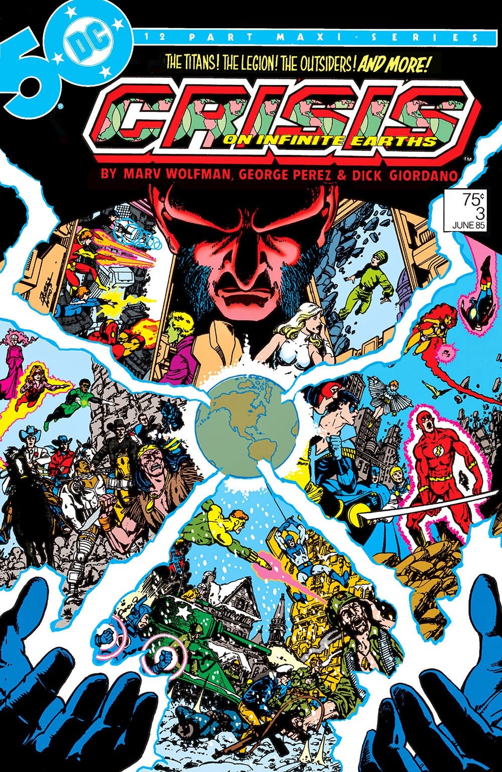
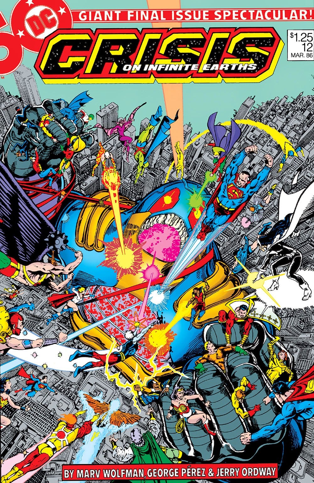
And just one year later, Pérez was fully embedded at DC Comics. There he drew Justice League of America and co-created New Teen Titans. In addition, he drew tons of covers for series all across the main DC publishing line from Green Lantern to Legion of Superheroes to the first Who’s Who series to even the Dial “H” For Hero feature in Adventure Comics (I absolutely loved those). He went on to draw the landmark maxi-series, Crisis on Infinite Earths and then relaunched Wonder Woman to great acclaim and blockbuster sales. In just a few short years, Pérez cemented his legacy and became the true legend he was always meant to be.
He also became a much better artist, on every conceivable level. Just compare the first issue of New Teen Titans released in 1980 with the first issue of the “Baxter format” Titans from 1984. On a purely visual level, the latter is light years ahead of the former.
And then… in a move that seemed to shake the very foundations of the mainstream comicbook industry, John Byrne migrated over to DC, relaunching Superman and taking on the entire DCU in the Legends mini-series. The general thinking at the time was that Byrne was going to dominate DC the same way he had dominated Marvel.
But y’know what? It didn’t quite turn out that way. And, through it all, George Pérez was still my favorite DC artist. No one ever visualized it better than he did. No other artist never sold it to me so perfectly as a place that could exist in my mind. Not before and, in my opinion, not since.
Because where Byrne’s art gave the Marvel Universe a grounded realism that completely sold the un-realism of its superhero inhabitants (as I detailed in last week’s newsletter), Pérez gave the DC Universe the pure, mythic grandeur… the bigness… the sheer epic scale of it… that it always required. Byrne’s more “realistic” art style (comparatively speaking) couldn’t possibly match that. The DC Universe and the characters who inhabit it demand a different set of aesthetics. George Pérez’s style was that aesthetic.
I mean, the evidence of this opinion is crystal clear, as far as I’m concerned. Just look at these covers…
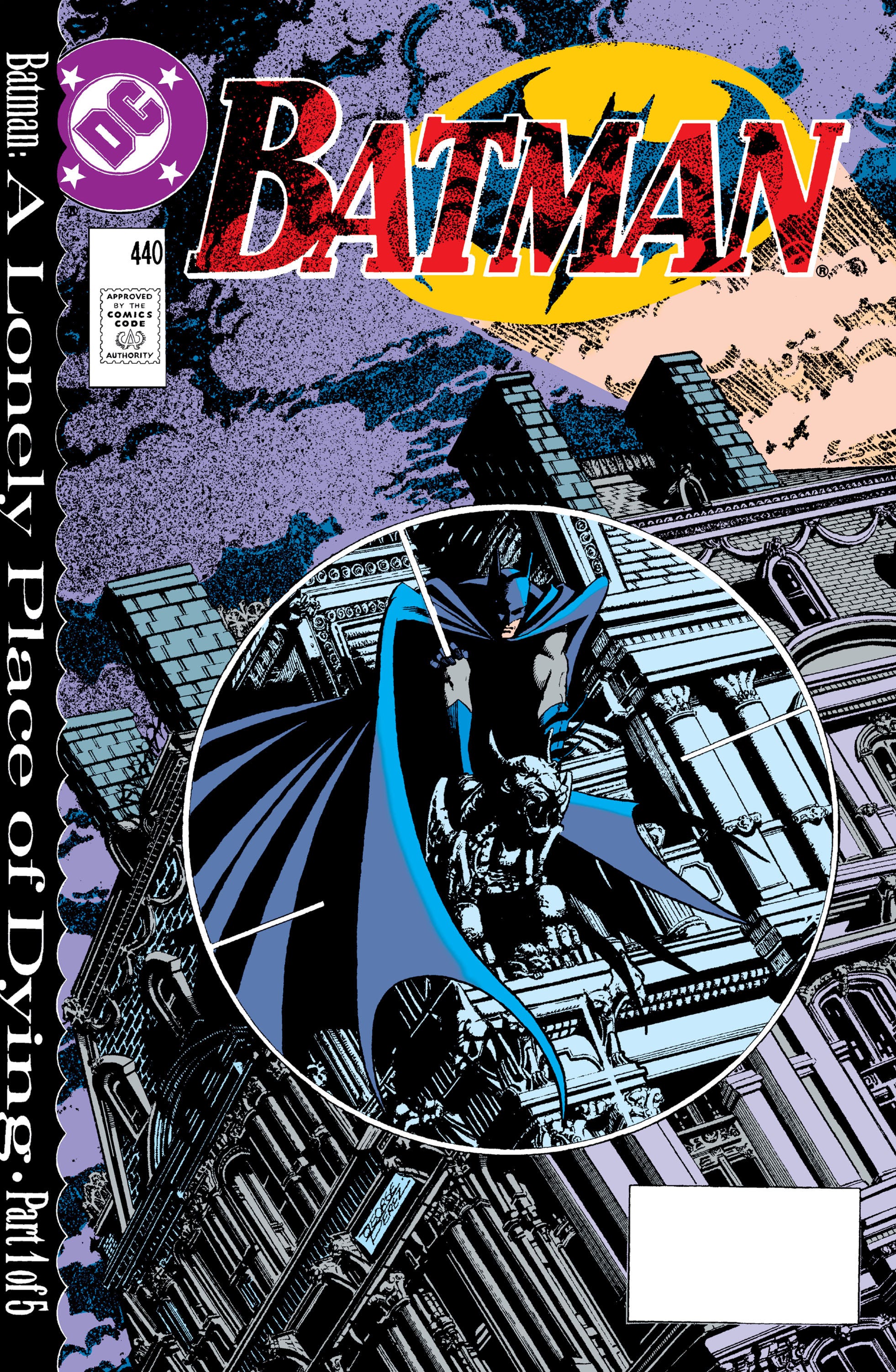
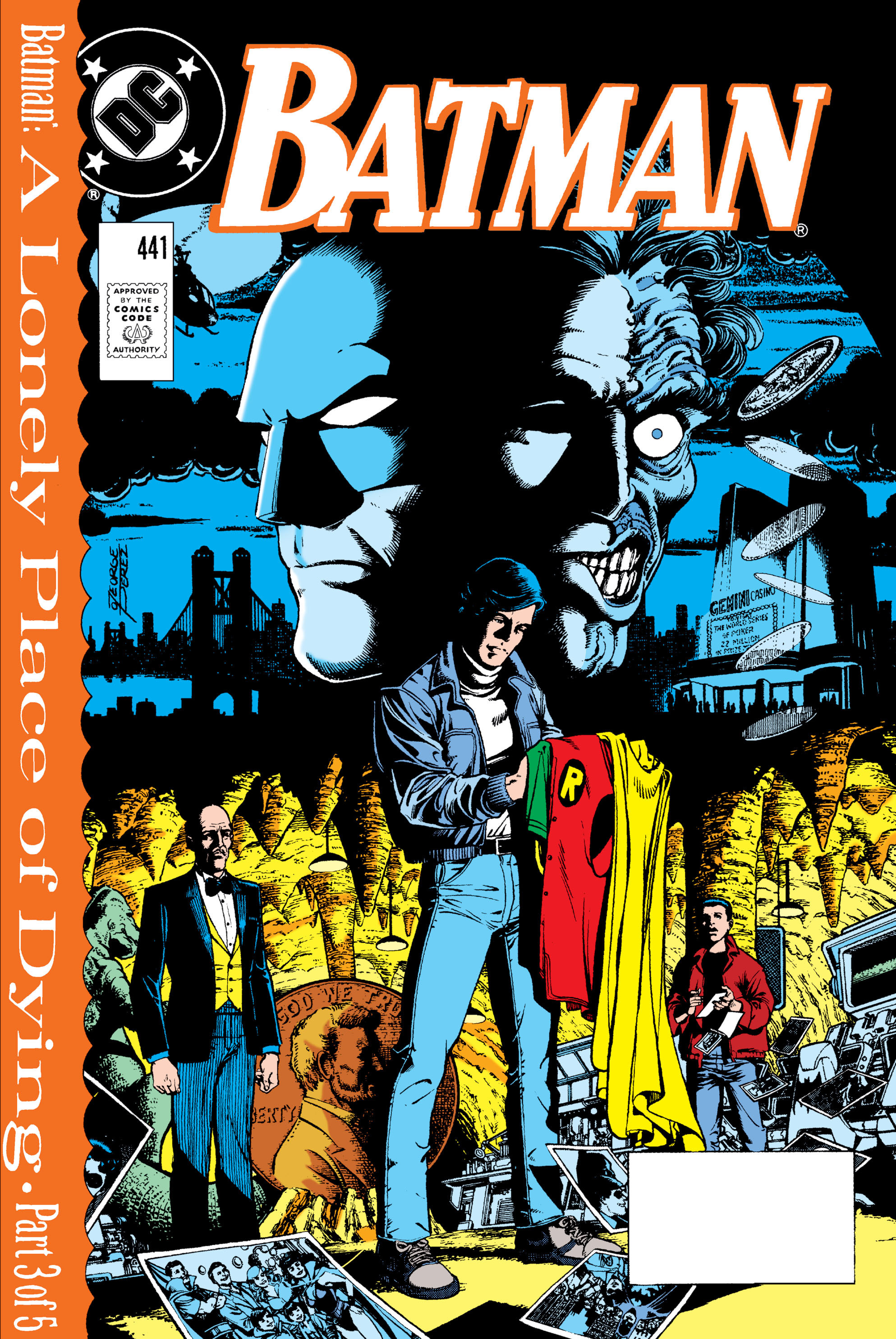
And if you think Pérez was only about cosmic spectacle, take a peek at these fantastic Batman covers, which perfectly capture both the unique, gothic architecture of Gotham City and the dark moodiness of Batman’s world…
And this is just the tiniest sample. I could’ve overloaded this newsletter with iconic Pérez art… covers and pages and moments that absolutely defined DC Comics in the 1980’s (to be fair, my most formative years)… so much so that, as it is with John Byrne and Marvel, George Pérez’s art is exactly what I imagine the DC Universe looks like to this day.
So there you go. I warned you early on that this was gonna be some deep fanboy shit. But I’m glad I finally got it off my chest (so to speak).
Joe Casey
USA
I think you could argue that the whole DC CW era of superhero tv with attractive/glamorous-looking young actors was essentially bringing Perez's vision to life.
I look at those Batman covers and consider it a great shame that Perez never got an extended run of any sort on Batman in the late 80’s or early 90’s. Byrne also never getting a run of Batman issues is another shame.