So here’s something that might be marginally interesting… at least from some sort of vague, historical perspective. Let’s talk about another project that did not achieve liftoff.
I’d met famed artist, Mike Allred (and his supremely talented wife, Laura) during the madness of the big X-launch in 2001. I was already a big fan of Mike’s work for nearly a decade at that point, and where Grant was writing NEW X-MEN and I was writing UNCANNY X-MEN, Mike was drawing X-FORCE, with the great Peter Milligan writing. A subversive shock to the system (in terms of your usual Marvel mutant fare), their series was completely endemic of the NuMarvel methodology of simply trying weird shit. Why not turn X-FORCE into biting satire? Great stuff, all around.
A few years later, Mike and I connected on the phone and started scheming on how we could possibly work together. This was one of the ideas I came up with.
In terms of the actual content, I really don’t know what the hell I was thinking… other than the fact that I loved Mike Allred’s art and really wanted to work with him. Like I said, this was not the only project we discussed, but it’s the most relevant to the X-related subject matter I’ve been discussing on here lately. It’s a pretty wacky concept, all around. But with Mike drawing it, I figured we could make it work. Not to mention, Mike was and is a top flight designer, so on that level, I knew it would at least look fantastic.
I seem to recall that, since it was already a retcon-based idea, I considered pitching this as a bona fide, branded sequel to the X-MEN: CHILDREN OF THE ATOM mini-series I’d done almost ten years earlier. I thought that the name recognition -- such as is was -- might give it a little more top spin, as far as having some potential value in the marketplace. After all, it wasn’t the most obviously commercial of ideas.
Basically, what you’re about to read -- if you’re so inclined -- is what I originally sent to Mike Allred to try and kick this whole thing off. I later refined this material to fashion an actual pitch document that I sent to Axel Alonso (who was the X-editor at that time). Needless to say, for whatever reason, it was not bought.
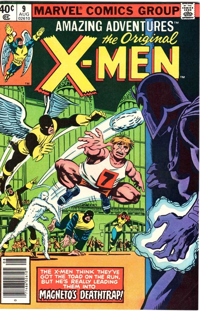
By the way, the “Amazing Adventures” title is a nod to the oft-used title that Marvel would occasionally haul out of the mothballs for various reasons, the final one (to my knowledge) being to serve in the early 1980’s as the reprint series for the original Stan Lee/Jack Kirby issues of X-MEN. Clever, huh…?
**********************************************
X-MEN: AMAZING ADVENTURES
character/design notes
3-26-2007
FROM: Joe Casey
TO: Mike Allred (and Laura, too)
Basically, the hook of X-MEN: AA would be the following... NEVER BEFORE REVEALED! THE FINAL EXAM! That's the way to sell it... that this previously untold tale examines the original X-Men's most "amazing adventure", playing hooky from Xavier's school in all-new superhero identities. It starts off innocently enough, but soon escalates into a much bigger roller coaster ride for the kids, who quickly realize they’ve gotten in over their heads.
In terms of the villains they encounter, I figure it goes like this... they start out trying to tackle simple street crime, which leads them to an encounter with, I dunno, the Scorpion or the Trapster (someone of that nature). This leads them into the world of organized crime, brushing up against the Kingpin's domain. This leads them to do battle with a previously unrevealed incarnation of the Masters of Evil (leaderless, but consisting of Radioactive Man, the Melter, the Human Top, Power Man and the Living Laser). Defeating the MoE puts them on S.H.I.E.L.D.'s radar, and they are soon recruited as a special S.H.I.E.L.D. strike force to take out a Hydra sect. This leads them to their final mission... taking on Dr. Doom in his homeland of Latveria.
So, I know what I just described sounds like a pinball machine out of control, but there's a coherent thruline to all this stuff. One villain leads to another. And the idea is that, with each escalation, the kids are shitting themselves... as in, "This is getting much bigger than we thought it would!" Now, in the end, we'll reveal that Prof. X knew about their extracurricular activities the entire time, and was even quietly pulling a few strings behind the scenes. It was all part of their final exam as X-Men.
The main thrust of the series would be that 1) we see these characters going after some real heavy hitters in the Marvel U. and 2) the new identities might actually catch on as characters. I'm pretty happy with the alternate i.d.'s, and if I'm digging them, maybe readers will, too. Hell, if it all goes well, there's always the opportunity to tell a modern story where these characters -- as adults -- don these i.d.'s once again for a modern-day adventure.
The idea with these new “alternative” superhero identities for the original X-Men, is not to think of it as “retro” or “60’s” in approach. One way this series will really sing is if we treat it almost as a contemporary series. After all, even in Marvel Time, the original X-Men experienced those Stan/Jack adventures maybe eight years ago. So, instead, when you start designing these guys, think of the mindset of a teenager, and what a teenager might think was cool about a sleek superhero costume. We want these new uniforms/new identities to be as hip as possible (in the same way you and Milligan made the X-FORCE/X-STATIX characters so of the moment). At the same time, think of the context of the Marvel Universe that this series would be set against. These kids would’ve seen the original Avengers, the FF, even Spider-Man as the cutting edge of superheroes at that time.
The main thing to keep in mind, is that these costumes should have NO design connection to their X-Men black-and-yellow uniforms, nor should they have any kind of “X”-related iconography involved. Remember, they’re not going out as “X-Men”, they’re going out as independent superheroes. Obviously, they should all have masks of some kind, since on some level they’re trying to disguise themselves from Professor X (who, as far as they know, has no idea that they’re going out and doing this… but, of course, since he’s Professor X, he knows everything. He just doesn’t want the kids to know that he knows… if that makes sense).
Anyway, here’s the characters, their new codenames and just a few costume suggestions to get you started…
MASTER BLASTER (Cyclops) – I was thinking, since Cyclops might be the most hesitant to go along with this scheme, he would wear a full-face mask (like Spider-Man or the Black Panther) with cool-looking sunglasses built into the mask. Within each “lens” of the sunglasses are mini-visors (slits cut horizontally across the center of each lens… so when he uses his optic beams, he fires TWO beams simultaneously). Other than that, it’s wide open for your design genius.
AVENGING ANGEL (Angel) – Angel will be the one who instigates this entire thing, harkening back to his pre-X-Men days as the costumed superhero, the Avenging Angel. My only idea for this is to go back to the Steve Rude design from the first issue of the CHILDREN OF THE ATOM mini-series (or a slight variation on it). The idea being that Angel just pulled out his “original” costume and used it here.
JACK FROST (Iceman) – Taking his new name from a Golden Age hero, Iceman is the character that I think needs the most radical design. After all, he’s simply an “ice man” when he’s a student. As Jack Frost, he definitely needs some kind of uniform to cover the majority of his “ice” form. Also, I think it’s worth it go with the more “crystallized” version of Iceman, as opposed to the early Kirby, “soft serve” version that had no facial expression whatsoever. Maybe, as Jack Frost, this was the first time that Bobby Drake realized he could have a more solid form, and more of a face with that form. As far as his uniform, I always thought that blue/black leather gear would look good against his ice skin. Maybe a jacket (kinda like what you’ve put on Madman every so often) over some simple kind of costume…
MAGPIE or REDWING (Marvel Girl) – I’m torn on which name is better for Jean Grey. Any suggestions, Mike…? In any case, I think the only thoughts I have on her are that RED should be the primary color of her costume, and that it should utilize some sort of “bird” motif (if, for no other reason, to telegraph the fact that one day Jean will become the Phoenix… and readers might dig it if we somehow gave a nod to it here).
STOMP (Beast) – Okay, for the Beast, I figure he wants to disguise the features that he normally displays as an X-Man, primarily his bare feet and bare hands. I thought it might be cool if he sported these insanely big Doc Martin-style boots (but more stylized, more colorful, more “superhero-y”) that had these intense, treaded soles. Hence, the name, “Stomp”. Yes, as Stomp, he’s still an insane acrobat, but his primary offensive attack is using his boots to kick the shit out of people. Kinda’ like Gorgon from the Inhumans.
So, that’s all I’ve got right now. Again, keep in mind that these kids have to spend most of their time in very utilitarian, two-color school uniforms… not to mention they all have to dress alike. So, these new identities should be cool and colorful and individualistic as hell. The kind of superhero costumes that are right up your alley, Mike. I know you’re going to knock this one out of the park.
Can’t wait to see some sketches.
****************************************
Needless to say, there never were any sketches…
Joe Casey
USA


